Friday, April 22, 2011

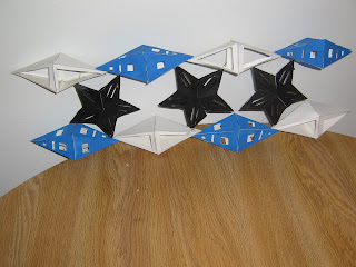
Project 3: Polyhedral Structures- Phase B

Research


Sketches


Project


Reaction

            Phase B of Project 3 was definitely better than Phase A. I had a much better idea of what I wanted to make and how to go about it. I chose these two polyhedrals because I like the style and combination of them together. I didn't want to use only one polyhedral so I chose the dypramid and this star shape to have a good mix of shapes. I love the negative shapes created and how open my wall structure came out. I didn't want it to seem to closed off, so I think the way I designed my wall structure was a good idea. I think the colors I chose were great because first I had black and white and didn't like the heavy contrast. I didn't want to take away all the white though so adding blue on every other added that pop that really helped brighten it up. The concept for mine I think is for the wall structure to be used in a house needing a very open and simple divider or maybe a child's room fro display and division. The negative space in the polyhedrals would create nice spots for display in a home or maybe even a retail outlet to display clothing or other merchandise.

Tuesday, April 5, 2011

Project 3:Polyhedral Structures (Phase A)


 Sketches
 Process


          The Polyhedral project phase A was not one of my favorites. I didn't know where to start and didn't understand the project at first which made it confusing. Once I understood the concept and how to make it, the development was a little easier. I still didn't really enjoy constructing my mask or the final result.  I chose these polyhedrals because of the shape and volume. The face needed to be somewhat flat or completely flat so that I could draw the face on and have it look the way I wanted. The headpiece and bottom embellishment were all triangular shapes because it presented the way I had wanted it too. I took the pyramids and dipyramids and cut some and half and cut through the folding creases so I could peal back each face of the polyhedrals so that I would get more volume and the look of a Venetian mask's headpiece that I wanted. The colors I chose were because they looked really energetic and similar to the colors some Venetian masks have. I also thought the use of the complimentary colors would help create an interesting contrast. Even though I didn't like the project I do like how the colors of my mask work with each other.